
Behind the Scenes
Breaking down of what went into my motion designing


I'm Constantly trying new things, go check out BTS to see how I made these or my Play page to see more work


E.L.F Promo (SPEC)
This Promo makes the viewer feel as though their playing a classic dress up game on GirlsGoGames.
Glamorously ending with full face with E.L.F. makeup products.
Software used:
Adobe Illustrator, Adobe Stock, Adobe After Effects, & Westar Music
This E.L.F. promo started with me wanting to create an ad that could be posted on YouTube or TikTok without feeling intrusive. I wanted something nostalgic, while telling the target audience —primarily of Gen Z and Millennial women— we see you and we get you.
I landed on recreating the childhood experience of the web-browser game platform "GirlsGoGames". Women get to see their childhood love of dress-up & their adult makeup routines married with E.L.F.
To find the right style, I drew concepts that clearly call back the games, while updating the look to fit the grown audience. Using my storyboard, I selected the ideal vectors from Adobe Stock for the woman, background, and makeup brushes.
It takes 9 steps to do a Full Face of makeup. I researched E.L.F. Products to pickout the best ones that visually show what each step does. I pen-tooled all 9 makeup products with color variants, myself in Adobe Illustrator.
I also made side and bottom game menus with mini icons of the products.
Staying organized before moving into After Effects is key. I pre-make a folder to house my music/sound effects, Illustrator files, and the A.E. file.
For each comp/scene, I made a separate Illustrator file based on my storyboard . So when I open A.E. I can splice each file into its own dedicated comp and get straight into animating without any confusion.
After the separate comps are animated, I put them in a new main comp. Going through everything to make sure it matches up as they overlay or transition.
I also animated a logo build for E.L.F., keeping the magical feel of the promo but elevating it to read classy and elusive.
The Magic

How I made the Menu Pop ups,
To make sure to sell the game feel I wanted to animate menus that popped open and close.
I made 2 versions of each menu so I could swap them out, pushing the animation to be on the bouncier side while still feeling like its sliding.
keeping them in their own comp, helped me jump to and edit them no matter what step I was at on the face.


"CD Baby" Lyric Video
A Lyric (music) video for Chloe Moriondo "CD baby"
Software used:
Adobe stock, Adobe Illustrator, Adobe After Effects, & Westar Music
I already new I wanted to do a Chloe song I just had to pick one out. Once I did I sketched general thumbnail concepts.
I opened up adobe Illustrator and look at her album covers and picked out type wanted to use. Along with a color pallet.
With that I opened after effects and a page of all the song lyrics. Went through and timed all the text, then went through adding transitions once I started making Graphics inside After effects.
Once I felt good I went to adobe stock and downloaded a few half tone Graphics and textures.
I added them, animating to different beats than the lyrics. I polished everything and making sure the colors felt cohesive and lined up with the song.
The Magic
Yes or Maybe Break Down,
Once the lyrics where times I made strokes around/near "yes or maybe" using the shape tool.
I added a mask by coping the shape, content, path.
Used the generate stroke effects and added the key frames to animate the stokes on.


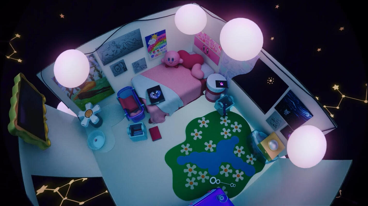
Cinema Promo (SPEC) Toy Room
A full face of elf inspired by those makeover games on GirlsGoGames lots of us played as kids.
Software used:
Adobe Illustrator, Cinema 4D, Adobe After Effects, & Westar Music
I started wit a Cinema file my teacher gave us of a open room. I found old pictures of a cardboard room I had built and decorated when I was 7 or 8.
I made a new cinema file and pulled inspiration for the furniture/toys. Sliding them over when each was done being modeled creating a line. I added the models into the room texturing them as I placed them. Some models were made like the cardboard edges and the plastics, and some where downloaded like the white cardboard sides and the felt rugs. Added a HDRI and lighting.
Went onto westar and graded a song I felt fit the feeling.
Then duplicated the file and animated all the models pop/come into the room. Added a camera giving it dynamic movements. Once the camera felt good I rendered everything.
I opened After Effects Set up my puzzle mattes and adjusted the objects adding effects were desired. Also adding in adjustment and looks layer, finishing up.
The Magic

Dynamic Camera!
It's lot of touch and go but I started by just adding a key frame of all the stops I wanted the camera to see.
I went though and added smother transition/in-betweens.
once all the "stops" where settles I played in the Graph editor until the camera felt smooth but lively.


Lego Promo (SPEC)
Heres my shot capturing the simple fun of lego, and why everyone can find something for them.
Software used:
Adobe Illustrator, Adobe After Effects, & Westar Music
Started with me picking a company (lego) and sketching out some thumbnail concepts for the Idea I had. I knew I wanted to show case all of the markets of Lego.
I worked on writing a script, then went into a story Board to add visuals to highlight what I wanted to say.
I figured out which types of products I wanted to showcase. I went into Adobe Illustrator and made Vectors based of the 4 Products and logo/build. I hand made the lego arms, bricks, and roses. Then pen tooled over lego official product shots for the more complicated legos (the orchid and 4 front succulent pots). I also used the image trace tool on the box and the 5 background succulent pots. I also Designed text for my script.
I picked music and uploaded it all into After Effects I set up the 5 comps I needed. I started by animating the logo build. Then I went thorough animating all the text, Once that was done I went into the 4 remaining comps and animated each scene, and their transitions.
With that I was done.
The Magic
Complicated product Graphics,
I picked out which assets where important enough that I didn't wanna image trace them, But where too complicated to just make on my own and found lego official product shots.
I when over the image making shapes with the pen tool so I'd get a good silhouette while also using gradients to build the depth and shape of the parts.
I went through the gradients making them line up with the lights and shadows to create from and not just be the right colors.


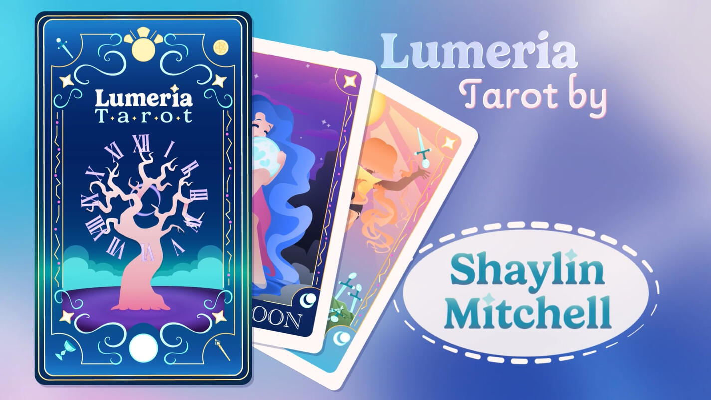
Lumeria Tarot Promo
A full face of elf inspired by those makeover games on GirlsGoGames lots of us played as kids.
Software used:
Adobe Illustrator, Adobe After Effects, & Westar Music
Started with just making the cards. I had to pick 2 tarot cards, then sketching out how I interoperate/would depict said cards. along with potential back design.
Took those sketches into Adobe Illustrator. Building up the style and colors. Settled on a new card back design that I built the box design of off. including making a font "family".
Went back to my sketch book to make a story board for the promo.
Made another Illustrator file for each scene planned and made all the new graphics needed.
With all the graphics done I got a westar song and took everything into After Effects. I made a comp for each file and started animating each one. Then put all the comps in one adding transitions and fixing the timing. I added my end card and let it hold and with that I was done.
The Magic

Growing up Transition,
First I needed to have young girl and older girl graphics.
I kept the body the same and just scaled it up with the hair morphing. I also smashed cut the young arms out and the older ones in.
The hair was done but duplicating the pigtails and animating the shape path. Going from pigtails, an in between and then like the silhouette of the long hair. I added a glow effect to feel more magical Before fading the duplicates out into the new hair graphic.


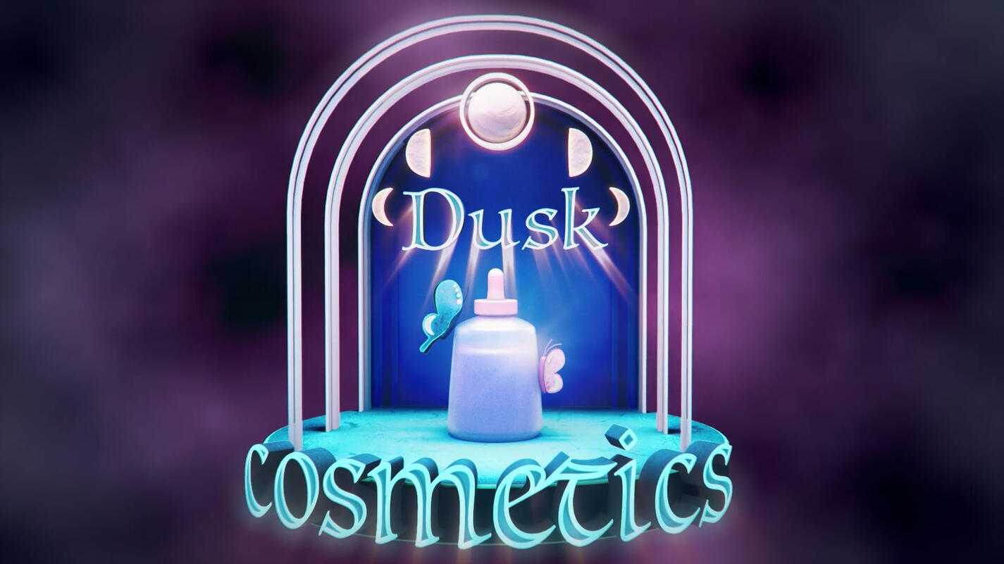
Cosmetics Promo
A sleek but magical promo for my dreamed up cosmetic brand, Dusk Cosmetics.
Software used:
Adobe Illustrator, Cinema 4D, Adobe After Effects, & Westar Music
It started with a 3D logo I came up with for a prior project. Were I sketched, modeled, and animated a logo build for my own made up brand. This project I was tasked with adding to the logo build and making a promo.
I picked out the elements I wanted to highlight and made a storyboard around that.
I jumped into cinema4D and grabbed the models I already made and duplicated the ones I needed. I set up a stage and made a second area and camera for my promo.
I animated my models, using tools like animating the cloner and the redshift view to animate objects to disappear. with the key frames made I went through and messed with the eases. I set up puzzle mattes and rendered it on our render-farm.
I took my video and audio into Adobe After Effects Set up my puzzle mattes and adjusted the objects adding effects were desired. Also adding in adjustment and looks layers. Added my fades and finished.
The Magic
Archways Building Out,
I made the archways and spaced the out how I wanted to look after the animation was done. I added a keyframe where the animation should stop and a keyframe on "1 Z scale".
Animating Backwards going back when I wanted them to build out and gave all the arches a keyframe at the same far back spot and a "0 Z scale".


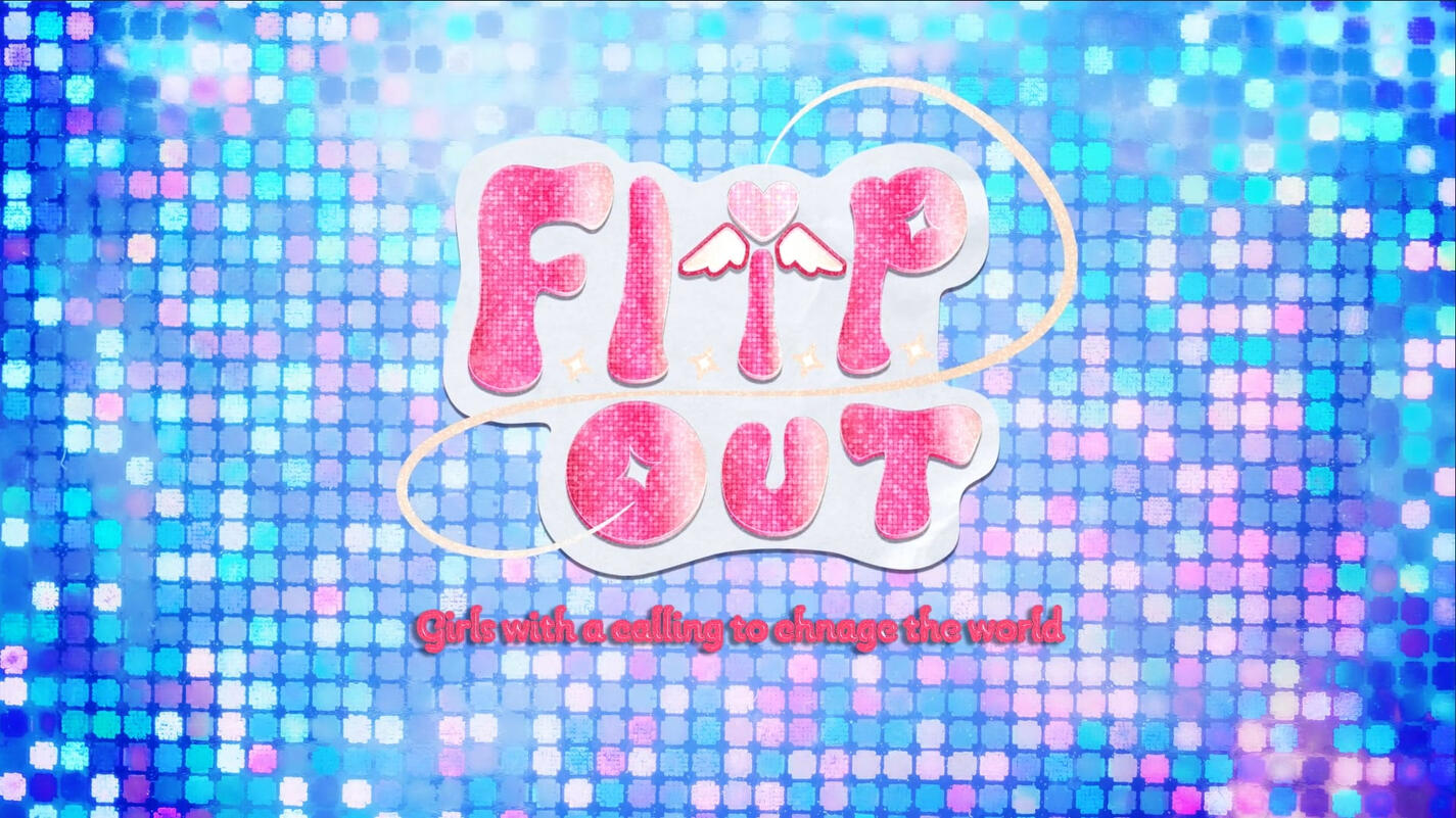
Flip Out Promo
A trailer promo for my Idea of a preteen/teen Magical Girls show Called Flip out.
Software used:
Procreate, Adobe Illustrator, Adobe After Effects, & Westar Music
Started with me coming up with four show ideas, picking the two stronger ones to move forward with refining. Sketching some rough visuals, show name, and potential logos.
I took those two Concepts two my teacher he fell for flip out so thats the one I moved forward with. I refined the Logo and started planning characters and a plot for a trailer.
I went into Adobe Illustrator and make 3 logo mockups and A style Frame in Procreate
While I was working in Procreate I hand drew the Library, Flip Phone, Main character's two outfits, and the final shot of all 6 Girls.
I meticulously perused west star to find the prefect song.
After touching base with my teacher I moved to After Effects animating the logo build. I set up the scene comps, and Started animating the first 3 scenes and their transitions.
I worked on making an interesting font style/effect and timing them to the scenes.
once I finished drawing the girl group I added them in and puppet tooled them. I added the Fades and it was done.
The Magic

Branded Text Effects,
First I found a font that matched the feeling of the show and the logo I made.
Then I picked a color darker than I wanted so It'd match the color family after the effects.
I added effects added where cc glass (to bring back the fun colorful clear tech products from the early 2000s), uni-grain(to make the glitter look), Glow, and a drop shadow so It'd feel apart of the space but still visible.


Flip Out Title Sequence
A Intro for my Idea of a preteen/teen Magical Girls show Called Flip out, I had made a trailer for.
Software used:
Procreate, Adobe Illustrator, Adobe After Effects, & Westar Music
I already had the concept, trailer and logo build so I started with what I wanted to flesh out.
I went back into Procreate and and drew college campus buildings, foliage and ground assets to make another background. I also made a line of lockers with things inside to showcase all 6 girls personalities. To go along with their lockers I drew each of the 6 girls in a magical pose in their everyday outfits and their power up outfits.
With everything drawn I added them into Adobe after effects with the audio. I set up the comps I'd need. Adding the new things and animating them with some of the things from the trailer.
I came up with names for the girls and their season 1 villain, and added them into in with the font I made and a complementary font for the theoretical voice actor names.
The Campus background, and locker doors animate in z space, and I puppet tool the characters. with that I make the transitions and the credits.
I add the fades and then I'm done.
The Magic
Designing 6 Characters (with 2 looks),
I had a really strong brand Identity and mood board so I referenced that a lot while making the charters. I tried a few styles but landed on one I used for another drawing a few months prier.
I went through and got a base idea for proportion and hair styles. Then I played around with body types. I wanted to have a lot of different personalities so I tried showing that with each of the outfits. I only did line art to sketch and colored without lines to see the blocking/silhouettes.
Ones I felt like each characters look was where I wanted I posed them up the sketches using the lasso tool for a group picture and got to work drawing it in the style of the promo.


Daily Render
My teacher wanted us to look into the process of making 3-5 second small renders daily. He didn't have us making one everyday but showed us designers how did and the benefits. He did however have us make 1 render each week for that month.
Software used:
Adobe Illustrator & Cinema 4D
Daily render (case study) : this was my first daily render I wanted to make a simple logo and animation for record and radio store. I designed my concept in Adobe illustrator, set that into Cinema 4d and made my Records, "planet" rings, background, text, and stars. With the models I went and made all my textures I had the most fun making the frosted glass for the text and the record adding smaller groves with displacement mapping.
I added my hdri and spot lights to my scene, using pink and blue to keep the lighting in the color pallet.
I went on to animated my objects and camera.
With that I rendered it out, and I submitted my render.
The Magic

Text Texture.
2After Finding a font I liked for the text I wanted the inside to have a frosted glass/clear plastic look.
I achieve that by adding one of Cinema4D's dirt textures into the node's metalness,
Base properties : roughness at 0.269 , IQR at 1.5 , transmission a brighter version of the base color with a weight of 0.5 , and emission of 0.1 and a lighter version of the base color.
